Counting to 10 Million Stars
I've started a new project working with 10 million stellar PSFs. In my first few steps in the project I performed some model fitting and made a pretty visualization of the individual data points.
My New (Little) Big Data Project
I am starting a new project that I'm pretty excited, it's one of the reasons I decided to start this blog. about because it is pushing me more in the direction of "Big Data". Lots of people throw the term big data around with different meanings. Personally, I consider something to be Big Data when the complexity of the task is dominated by complications from the size of the data. The "task" could be anything related to the data including storage, computation, or visualization. Specifically, this project is going to push the computation and database aspects of my work into the Big Data zone.
The dataset for this project is 10 million stellar PSFs observations taken with the HST WFC3 UVIS instrument. These PSF were data mined from the total on-orbit data set of roughly 35 thousand WFC3 UVIS observations using a colleague's specialized FORTRAN code which extracted a 11x11 array centered on each PSF. This is an especially powerful method of constructing our dataset because it allows us to use any incidental PSFs observations when the target was not a star or stellar field.
Fitting 1-D Gaussian Distributions
After some initial work I was able to create a reader that takes the outputs text files from my colleague's code and transforms it into a numpy array. Next, we decided we wanted to start by characterizing the PSFs with two 1-D Gaussian fits through the center pixel, one in the row direction and another in the column.
First of all, I was shocked to learn, after an hour of googling and popping my head into people's offices, that the definition of a Gaussian distribution isn't tucked away somewhere in NumPy or SciPy. Thinking about it, it guess makes sense because it's not clear what format your inputs and outputs should be, but I'm still a little surprised that all the tutorials I found on this subject began with defining the Gaussian distribution. Anyway, once I got past that the rest wasn't too hard.
import numpy as np
from scipy.optimize import curve_fit


def gaussian(x, A, mu, sigma):
    """Definintion of the Guassian function."""
    return A*np.exp(-(x-mu)**2/(2.*sigma**2))


def get_gaussian_dict(data):
    """Use curve fit to return a dictionary with all the model
    information."""
    p0 = [data.max(), np.where(data == data.max())[0][0], 1]
    coeff, var_matrix = curve_fit(gaussian, range(len(data)), data, p0)
    A, mu, sigma = coeff
    output_dict = {}
    output_dict['amplitude'] = float(A)
    output_dict['mu'] = float(mu)
    output_dict['sigma'] = float(sigma)
    output_dict['var_matrix'] = var_matrix
    output_dict['model_data'] = gaussian(resample_range(data, 10), A, mu, sigma)
    return output_dict
I use scipy's impressive curve_fit function to perform the model fitting. The last argument curve_fit takes is p0, the initial guess for the fitting parameters. Fortunately, our data is very well behaved so we can easily do a good job guessing the initial parameters from the input data. Because I like to make my functions as general as possible I return all the possible information from the fit in a dictionary. For example, in the future I'll probably want to dig into the covariance matrix that the curve_fit returns to calculate a goodness of fit estimator and I'll be able to do that with the same function.
Eye Candy
Finally, all this is all visualized in the 4-panel figure below.
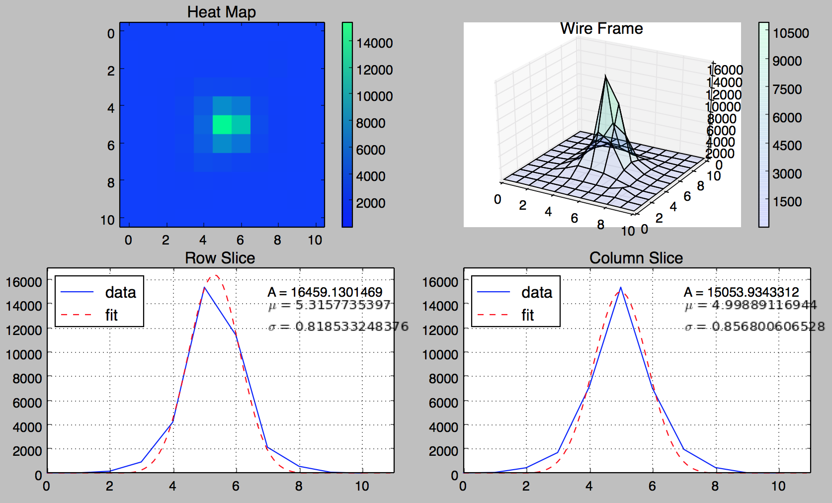
The bottom row contains the row and column slices and the Gaussian fits with the model parameters printed in the upper corners. The upper row contains a heat map, and just for fun, a 3D wire frame for the PSF. I could make some tweaks here and there such as matching the wire frame and heat map color bars but this is already more than enough to visualize a single data point, I need to start working my way up to 10 million.